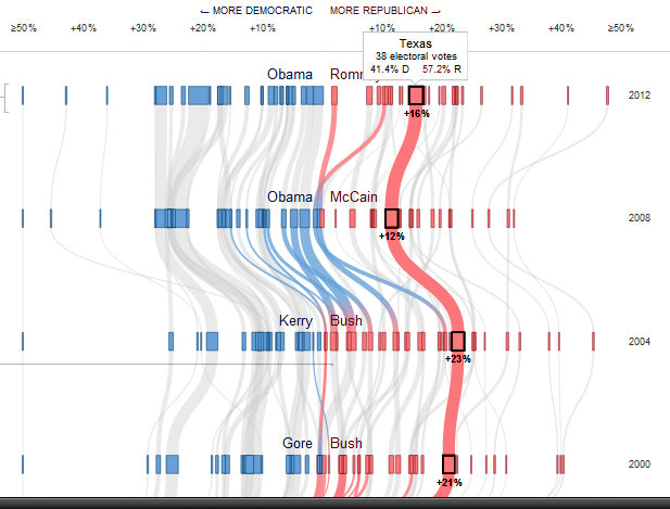
 Explore one of the cooler interactive graphics we’ve shared in a while!
Follow 60 years of voting history. This graph provides an amazing historical perspective on how states have shifted over past elections.
Each wavy stripe represents a state. Scroll over each line to watch how opinion swings.
 At GISetc.com we curate and bring you the best science resources from the web. We hope our sharing will keep you up to date on the latest science and geospatial news.
With Super Tuesdays we are careful not to endorse either party. We strive to present unbiased links that can spark conversations based on current events in your classroom.
By MIKE BOSTOCK and SHAN CARTER; Additional reporting by AMANDA COX Source: Dave Leip’s Atlas of U.S. Presidential Elections http://www.nytimes.com/interactive/2012/10/15/us/politics/swing-history.html
