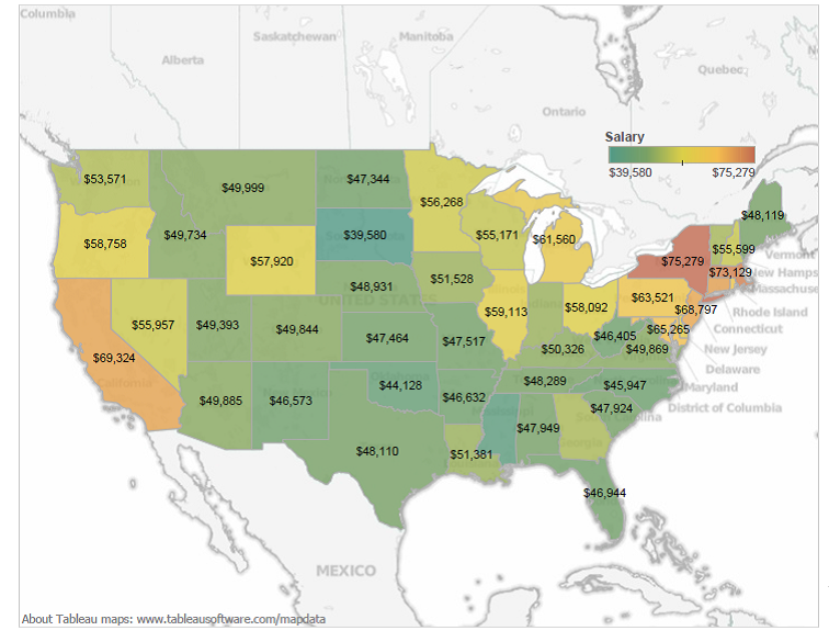
Data, state by state, collected from the National Center for Education Statistics by Jon Boeckenstedt, associate vice president at DePaul University in Chicago. Originally posted by The Washington Post.
Ever wonder how your state stacks up to others when comparing teacher’s pay? The National Center for Educational Statistics compiled a map based on elementary and secondary education salaries last year to answer that question.
Click here to compare the salary map to the national cost of living map (with the average cost of living per day across the country) and see why some state’s totals are so much higher than others.
At GISetc.com we curate and bring you the best geography and science resources from the web. We hope our sharing will keep you up to date on the latest science and geospatial news.

View our gallery of TEACHER inspired flair and be sure to check out our teacher income related designs!

