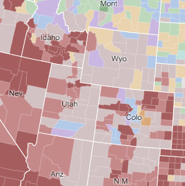
 In 2009, the New York Times published a wonderful interactive map of immigration to the U.S. from 1880 to 2000. The spatial dimension of that immigration process is emphasized by showing a nicely projected map of the 50 states down to the county level. Lots of questions with spatial dimension could be asked after exploring the distribution patterns, even over time.
