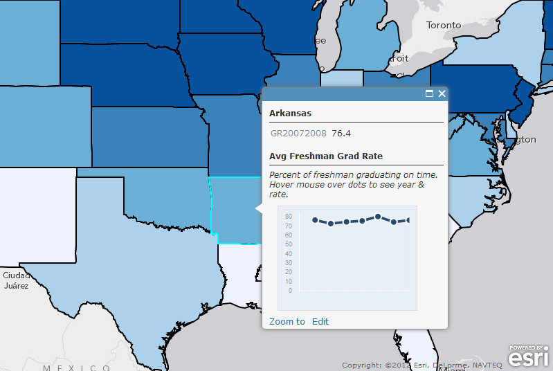
The following contains excerpts and links from an article about graduation rates across the United States. Another great interactive map by our friend Charlie Fitzpatrick at ESRI.
“Data and more data! It’s a challenge for today’s students, educators, administrators, and policy makers alike. The US Government just unveiled a new portal for education data. I spent some time browsing, and found a set of data I’d like to see in a map with a chart: high school graduation rates.
As an educator, I might push this data into a shapefile and post it for students to use, or ask them to go through the exercise. The first route maximizes time for analysis, the S and M elements in STEM; the second route maximizes development of the T and E in STEM. Either way, it’s a benefit.”
Be sure to explore the full interactive version of the map through ArcGIS Online.
“Students today are facing exploding universes of data, and the need to learn how to make decisions about its quality, its relevance, the ways it can be employed, and what it means. They need frequent practice with these tasks. It needs to become second nature if they are going to be good problem solvers in the years ahead.”
At GISetc.com we curate and bring you the best geography and science resources from the web. We hope our sharing will keep you up to date on the latest science and geospatial news. Read how Charlie made this map in the full article in here from the ESRI’s GIS Education Community Blog.

