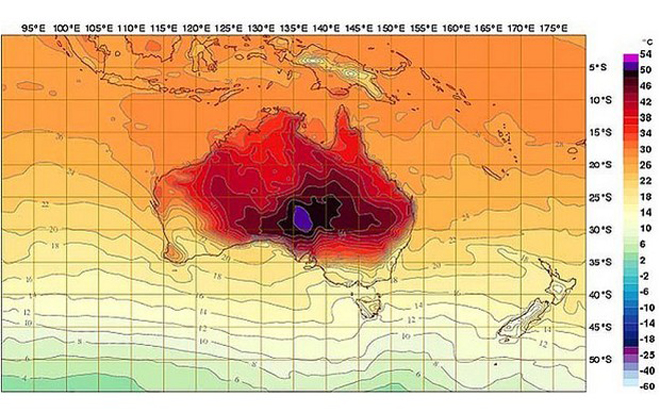
 It’s heating up! As we roll into August, let’s take a look at temperature maps from around the globe…
“What happens when a changing climate exceeds the operating parameters of the stuff we own? While we in the northern hemisphere make jokes about indestructible snow forts, it is getting hot in Australia. How hot? So hot that Australia’s Bureau of Meteorology had to add new colors to its weather map. Now, those unfortunate parts of Australia that achieve temperatures above 122ºF (50ºC) — temperatures that were, until recently, literally off the scale — will be marked in deep purple and terrifying hot pink. It is an interesting moment in data visualization history when climate scientists find themselves in the position of revising the upper bounds of temperatures they ever expected to depict.”
This is fascinating stuff – be sure to click the link to read the full article and see more about their incredible heat wave!
At GISetc.com we curate and bring you the best geography and science resources from the web. We hope our sharing will keep you up to date on the latest science and geospatial news.

